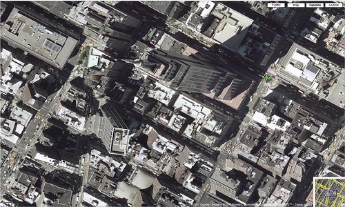
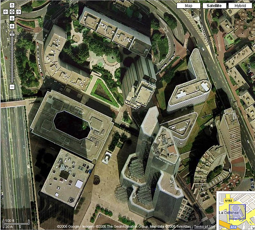
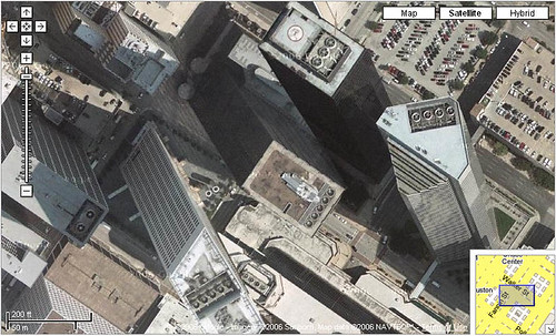
A recent quick review shows that Google Maps has cleaned up the “Escher Effect” seen in Satellite view. The Escher Effect is caused when two separate aerial or satellite pics are taken of different sections/plots of a city, and then stitched together to form a continuous composite picture. Each pic is taken from a different angle, so the taller building pictures are taken from different perspectives, causing them to appear to lean toward or away from each other.
The “Escher Effect” is named after the famous Dutch artist, M. C. Escher, who was particularly known for illustrations using optical illusions that often involved perspective and side effects from how perspective is perceived.
When Google Maps introduced satellite and aerial photos, there was a lot of the Escher Effect going on. Photographing a bird’s-eye view of the whole country requires a lot of photos, taken over a considerable period of time. In order to make the photos match up with mapped areas, and to make them continuously pannable, the photos have to be lined-up or “imposed” from edge to edge and blended together where they match.
Since many of the photos were taken at different times and at differing angles, buildings often appeared to lean in or out haphazardly, and sometimes other artifacts of the process were introduced as well, such as having shadows of clouds discontinue abruptly. The Escher Effect happened throughout Google Maps, but it was only really noticeable where edges of photos taken at different angles came together in places that had multiple, tall buildings.

Trammell Crow Center & JPMorgan Chase Tower lean towards each other in the Escher Effect in Dallas, Texas.
Unfortunately, the areas where the distortion effect were most pronounced and most noticeable were also the places where people tend to browse most often — downtowns of major cities, where more skyscrapers are located.
I was alerted that the issue might have been cleaned-up when a viewer of one of my screengrabs in Flickr commented that it was either a hoax or it had been subsequently fixed. No, it most definitely was not a hoax! After quickly reviewing the places where I’d previously found the Escher Effect in Maps, I can see that the downtowns of major cities have been more carefully re-composed. Buildings no longer seem to lean in towards one another, and shadows are all projecting from the same angles.
I’m not certain whether Google Maps cleaned this up, or the companies which supply them with aerial photos — I’d suspect it could be the latter.
The Escher Effect pictures were so convincingly Photoshopped together that they astounded people who didn’t grasp what caused the apparent impossibility. I’m sort of going to miss that amusing sensation when finding those paradoxical images in the maps interfaces!
Tags: aerial photos, Google Maps, M.C. Escher, optical illusions, satellite images, satellite photos


 ShareThis
[…] Google Maps previously had quite a bit of this going on, as I’ve documented in the past, and they subsequently cleaned up the Escher Effect. […]
What are some unknown facts about Google Maps?
Untill last early few years of advemt of google map many high rising building on the map had this flaw.. Or You must be wondering this could be mere software glitch or lens distortion but is due to the Escher Effect which is caused when two separat…