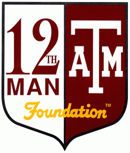
The recent Super Bowl hoopla brought the Seahawks 12th Man to national attention, but I wonder how many realize that this fan support concept was founded by Texas A&M University? Most of my friends and acquaintances are unfamiliar with my past ties to the A&M organization and its iconography as well. Shortly after college, I worked for TAMU as a scientific illustrator, mapmaker and graphic designer. While in that capacity, I designed the 12th Man’s iconic logo.
If you’ve driven around the state of Texas for any length of time, chances are good that you’ve seen this logo on decals on the back windows of a great many vehicles. I think it’s probably the most widely visible thing I’ve ever designed.
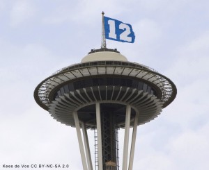
So, how did the 12th Man itself come to be associated with the Seahawks, way up in Seattle, Washington? Recent news stories came out on the subject on the eve of the Super Bowl, and it seems that the Seahawks began using the concept of the 12th Man in 1984. However, the Texas A&M University Aggies football team had started using the moniker back in 1922. (See The Eagle: Texas A&M legal department stays busy protecting 12th Man brand)
Backing up a bit — if you’re unfamiliar with the 12th Man, it’s a fan organization to support the football team. At A&M back in 1922, the Aggies were playing against Centre College in the Dixie Classic football game. Because of player injuries, the Aggie coach Dana Bible asked a student athlete, E. King Gill, who was not actually on the football team at the time, to suit up in Aggie uniform for the second half in case they needed another player to continue the game. This historic moment inspired the Aggie tradition of all students standing throughout football games, proverbially “at the ready” in case their team should need them, and they could be called into the game. The A&M football fans came to refer to themselves as “The 12th Man”, and eventually this was formalized into a nonprofit 12th Man Foundation which raises money in support of TAMU athletics, athletic scholarships, and more.
The Aggie football fan concept and the 12th Man nickname, evolved over time into a very powerful marketing vehicle.
My involvement with it was fairly tangental, beginning somewhere around 1993-1994, I think. I was working for the Texas A&M University Cartographics office — a quasi business unit that produced maps, scientific illustrations, slideshows, web design, and other graphic design services under the Geography Department within the College of Geosciences. While working there, I was approached by a member of the board of the 12th Man Foundation, and was asked to see if I could come up with a design for an alternate logo that they might use for clothing. At the time, I think the organization had one or two versions of their names that they used for everything — one of them was simply “Twelfth Man”, and the other was a very blocky, rectangular logo with the words “12th Man” in the upper half, and the word “Foundation” in smaller type in the bottom half. Boring — I think the font used for those logos was perhaps even Helvetica, and they seemed aseptic and nearly generic in the austere and plain graphic treatment.
I’m not sure how they came to select me — I think my work had been recommended by the university’s printing offices, or perhaps they had seen my work on A&M maps, or perhaps someone at the TAMU Press referred me. I was thrilled at the opportunity at the time, although I was young and naive and didn’t fully realize the scope of the opportunity as I perceive it now, decades later — for such a large and successful organization, it was sheer, astronomic luck that this landed in my lap instead of being farmed out to a larger, well-established logo and branding agency. Of course, the 12th Man Foundation saved mightily on fees for this by going with someone local, and a small office operated within TAMU. 🙂
It was a very valuable learning experience for me, as well. Designers of any kind eventually have to figure out how to work for groups of people, rather than merely individuals. While it was only one passionate, maybe even visionary board member who brought the project to me, my work had to satisfy a dozen individuals, some of whom had unrealistic notions of what works for logo design, and even what’s realistic in terms of fitting within a logo. Particularly, a logo that must reproduce down while still being recognizable and legible within a small bit of embroidery on clothing!
As I recall, they wanted me to pull in some of the university’s more recognizable iconography — they may have specified that it should be the “ATM” symbol, or perhaps they said I could use the University Seal, which was much more complex, if I could make it work. It had to also say “12th Man”, and “Foundation”. It had to convey Texas A&M, Aggies, while also being “12th man” and “Foundation”. One of the board members kept insisting that it could all be fitted into the outline of the State of Texas shape. Oh — and, to top it off, it had to be made to evoke a classiness, a prestigiousness, perhaps sort of like Ivy League colleges. (For those that are familiar with Texas A&M University, and its humble, agrarian roots as preserved in the “A” in “A&M”, I hope this mention about the “Ivy League” bit didn’t make you choke on your afternoon Dr. Pepper!)
In essence, the logo project request was virtually impossible. They were insisting upon throwing everything-and-the-kitchen-sink into it — which is precisely the opposite of what good logo design is all about. With so many disparate elements, the end result couldn’t be anything but a mess. Logos are supposed to be simple, elegant. If you have a huge name, you might instead design an icon symbol that communicates the feel of the organization, without attempting to list everything about the organization. Yet, the board members were all alumni, and Texas A&M had not had much in the way of arts education in the days when they were students. They were mostly literalists who felt that the logo needed to narrate rather than symbolize. As an artist, how do you create a logo in such a situation, without pulling out your hair?
I think I did pull out some hair, and likely spent a lot of late hours coming up with a handful of logo concepts for the board to see.
The design they ultimately selected was the one that I thought was probably the best design of the lot. I hit upon the idea of pulling in a shield shape to evoke a sort of heraldry, and divided that down the center, with the school colors of white and maroon on each side. On one side I fit “12th Man”, and on the other I fit a stretched-out “ATM” symbol to balance it out. Across the bottom I used a scripted calligraphy cursive for the word “Foundation”, and tacked on the “TM” trademark symbol at the end. For the “Foundation” word I used a gold orange color that was barely able to contrast with both the white and maroon backgrounds.
I was very pleased at the end result, and I was thrilled to see it in the catalogs and the 12th Man clothing line. Don’t get me wrong — I never thought this was any logo masterpiece like the “Coca-Cola” cursive logo, or anything! The logo likely cannot ever be truly great as long as it has so many odd pieces, combined. It’s actually an amalgam of logos. But, I felt like it was potentially the best solution possible.
The Foundation later made some changes to the logo. One change that I’d call a “refinement” was to exchange the hand-drawn cursive I used for “Foundation” with a serifed font. I heard later that they’d done that because it was easier for them to reproduce the logo in other media with an actual font. In any case, I don’t think it harmed or changed the feel of the logo overmuch — the spirit of my original design is intact. They flipped the maroon/white color treatment, which was probably a neutral change — the order of the colors would be important, depending upon what background color is used around it.
The other couple of primary changes they made to the logo are perhaps not improvements. The changed the stretched “ATM” logo I used for the more classic proportions. To my eye, this visually imbalances the overall design a bit too much. However, I know that the stretching of the ATM in my original design made some observers uncomfortable, and it’s entirely possible that the later personnel in charge of managing the university’s brand marks may have insisted upon using some standard ratio sizing. They also used a sort of 3-D shaded version of the “T” in ATM, which makes the logo slightly more busy.
Finally, they exchanged the gold orange color for the “Foundation” word and instead used a knockout treatment — white letters on the maroon half and maroon letters on the white half. I did actually experiment with that sort of treatment when I designed the thing, but it doesn’t work so hot when you get to the middle “D” letter, which must then be divided and made bicolor — it renders the word far less legible. I’m not sure why this was done, unless it was to reduce the number of colors of ink or thread for printing or embroidery in order to save money. I could conjecture that folks were uncomfortable at any drop of orange in the design, too — since burnt orange is one of the team colors of the University of Texas, the historic rivals of the Aggies. But, I never actually heard any complaints about the small amount of orange as a contrast color — and, it was gold orange, not burnt.
Cutting back to the present, I was amused to see all the many references to the Seahawks 12th Man as the Super Bowl approached. At the back of my mind, I figured that A&M had somehow licensed the brand name out, and indeed that’s the case. It’s amusing and galling to A&M alumni that many don’t realize that A&M originated the 12th Man for fan group branding. Just today I saw a Forbes guest contributor post an article on “How The Seahawks Tapped The Power Of The 12th Man“, and it neglects to mention how the Seahawks tapped the power of A&M’s established marketing machinery.
I think it’s no coincidence that the Seahawks adopted the name after A&M had been using it for many years.
A&M is probably the equivalent of Mecca for college football, and it would make sense for football teams to imitate the successful marketing techniques that were established in that sports incubator.
According to news stories and Wikipedia, Texas A&M sued the Seahawks to enforce their trademark ownership, and the Seahawks continue using the name out of a resulting settlement that is essentially a trademark licensing agreement.
I’m no longer a graphic designer, having abandoned professional design work many years ago to do search engine marketing and internet technology work, but I do still get contacted about my 12th Man design via my personal site, from time to time. I also designed and marketed a Texas A&M University Clip Art Disk containing the university’s first digital versions of their logos and other brand symbols when I worked for them, but that’s a story for another time.
Tags: 12th man, branding, logos, seahawks, sports marketing, super bowl, tamu, Texas A&M University, trademarks


 ShareThis
[…] the last 15 months, three of which involve the number “12″. As I wrote a year ago, the Seahawks were once sued by Texas A&M over using the “12th Man” name. That earlier suit was settled, resulting in a multi-year licensing agreement. The Seattle Times […]