Google’s Instant Preview feature, which allows one to click on a little magnifying-glass icon in search results in order to see how webpages appear, doesn’t support Google Maps, YouTube, nor Flash interfaces.
For instance, here’s the Map page from Elvis Presley’s Graceland website:
Yet, in Google Instant Preview, the main graphic element of the map is missing entirely:
Google rolled out Instant Previews with some fanfare a few months ago. According to their statements at the time, people making use of the previews were “more satisfied” with search results they ultimately clicked-upon, thus providing an excuse for its addition on the search results page (this is no minor thing — Google’s search engine result page or “SERP” is prime real estate, and they’re very conservative about anything introduced upon it).
The Instant Previews are a sort of generated screengrab image of webpages. Their systems likely leverage HTML interpretation software to compose how a webpage will look, perhaps based upon the Document Object Model, sized to the maximum width of the image size, along with some pagebreaks they’ve built in to abbreviate lengths of pages and highlight text from certain sections of it.
This isn’t actually anything new — search engines, directories, and internet yellow pages have incorporated preview images of webpages in their results for quite a number of years at this point going back to perhaps around the year 2000, but it was earlier done at a slightly smaller size. One of the best-known services to produce these preview thumbnail images is Girafa. Even more relevant to Google, perhaps, the underlying technology likely dates back to work by Jakob Nielsen and others at Sun Microsystems in 1999 (see “Method, apparatus and program product for updating visual bookmarks“). As you may recall, Nielsen is the usability expert whose philosophies were apparently very influential in the earlier days of Google when he was on their Technical Advisory Board. This may explain why Google has trotted out a fairly common feature that’s been around for at least a decade, and presented it as though it’s some completely new innovation.
Google engineers were quoted mentioning how Instant Previews was also intended to help speed up the internet, and Google’s been making strides in pushing their philosophy that the internet should speed up. (Recall that they formally introduced Page Speed as a ranking factor last year.) This unfortunately reminds me of how AOL used to cache webpages across the internet and compress everyone’s images so that their users would have faster browsing speeds — and, AOL also inflicted bad user experiences onto webmasters’ creations, since their image compression algorithm had a bug which caused certain types of JPEGs to have chunks of image screwed-up!
The main innovations involved with the Instant Previews seem to be the slightly larger size than what was often used in the past, the “call-outs” of text snippets which highlight portions of text matching the user’s search, and the jagged pagebreaks to visually abbreviate the length of pages.
So, considering that this is really something of a rehashed idea from nearly ten years ago, it’s surprising that Google appears to’ve rolled it out prematurely. Read on for some observations and solutions…
If you peruse the instant previews on nearly any given search results page, you’ll quickly find instances where the preview images have left out major sections of the webpage. Before even digging in to see what items were getting missed by Google’s preview image generator, it’s not hard to predict some things that might give them problems: JavaScript-activated UIs; framed HTML and iFrame contents — particularly frames which pull sections of content from other websites; graphic ads; Flash; AJAX; HTML5; and other rich media content.
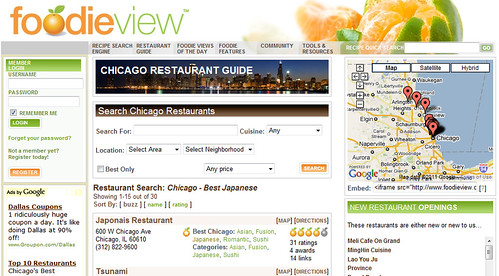
Even considering some of the challenges with richer media, it’s pretty surprising that Google Instant Previews do not properly support widely-popular content provided by their own services! Many webpages which sport Google Maps show blank spots where the map should appear. For instance, compare FoodieView’s page with how it’s shown in Instant Preview mode:
FoodieView with Google Instant Preview:
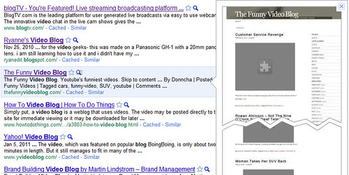
YouTube support is also missing. The Instant Preview for The Funny Video Blog shows the gray “plugin missing” puzzle icon for the videos which dominate its pages:
Instead of seeing images representing these types of content, users are seeing blank spots, blank boxes, or puzzle-piece icons (similar to the indicator that browsers display when you try to view a page that requires a browser plugin you do not have).
It’s not at all outside of the ability of Google’s engineers to’ve incorporated support for embedded Google Maps and YouTube. Google’s page processing algorithms already parse out geocodes from their embedded maps in order to decide if they’ll add a map “plus box” to the SERP where those pages appear. They could easily grab a map image from their own servers, snip it to the size shown on a spidered webpage, and compose it into the preview images.
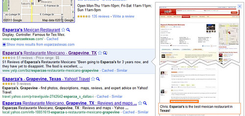
You could more easily understand them leaving the blank spots for competitors such as Yahoo! Maps on webpages, which they’re also doing, such as in this Instant Preview for a Yahoo local profile for Esparza’s Mexican Food in Grapevine, Texas:
Just as with Maps, they could do similar with YouTube. Each YouTube video has a static image generated for it in order to display as a sort of video preview — but these are being left out of the webpages as well.
The lack of support for Flash interfaces is perhaps the most understandable gap in the Previews, but it’s also perhaps the most-serious one, since a great many webpages are using Flash for the major visual components of their websites. For instance, here’s a screen-grab of HBO‘s homepage, which is mainly integrated into a big Flash interface featuring Lady Gaga today:
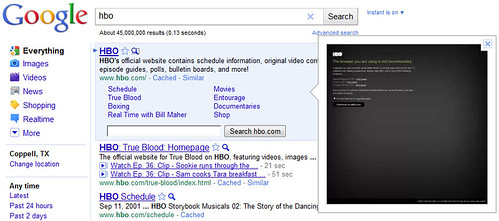
Here’s how HBO’s Instant Preview appears in the Google search result:
Under Instant Preview, instead of Lady Gaga and navigation controls, you are seeing HBO’s default screen for people who are viewing without Flash support – the message reads “The browser you are using is not recommended.” You can also see similarly nonoptimal previews for sites which have lightboxes, slideshows, and other CSS overlay screen features.
Flash interfaces are dynamic, often time-dependent (should a preview image show a “loading” snapshot, or a more final version of an interface?), and would be undoubtedly complex to convert into a thumbshot. But, the lack of Flash support is still disappointing, considering Google’s public support of Flash for Chrome and mobile interfaces that they’ve expressed in order to upstage Apple and the iPhone.
Now, there are some websites that have Google Maps images incorporated into their Previews and displaying properly. For instance Yelp’s webpage for Esparza’s does show their little Google Map in the upper right corner:
However, this is likely due to how they used the Google Maps API. The API allows you a few options for how maps are displayed, in order to meet different needs for different situations. One of the methods the provide allows you to display a static image of a map on a page. These maps are not dynamic — they cannot be zoomed and panned. They’re usually used as a sort of preview or map overview image that will be expanded when clicked, or opened in a larger popup window. Once clicked, the user can typically then interact with the map controls. But, the point is, the static map option is straightforward to convert into the Instant Previews because it’s just an image displayed on an HTML page, like everything else they’re already able to interpret for display. For webpages incorporating the dynamic embedded maps, the preview images are not happening.
Ultimately, the lack of support for these ubiquitous visual elements of websites demonstrates that Google’s rollout of new product features is seriously premature, and that they should coordinate better among the various departments. Products should not be rolled out without incorporating support for their previously-launched major products.
If the preview images truly are increasing the satisfaction of people who click on them prior to choosing webpages to visit from SERPs, then the corollary is likely true as well: having preview images that have gaps and missing-plugin-puzzle icons likely disatisfies searchers, and may reduce your click-throughs.
Also, it should be hard for Google to rationalize this situation. They represent that they’re devoted to the user-experience, but the number of users who are likely to encounter Instant Previews containing erroneous images with gaps is likely very significant. This is an issue impacting the quality of their results for a significant percentage of their users.
I expect over time that Google may fix these gaps. But, I don’t think the gaps should’ve been there at launch.
I noted previously that it was nonintuitive for webmasters when Google rolled out Instant Previews while disregarding noarchive protocol. They do provide you with the ability to suppress the Instant Preview interface for your webpage in SERPs by using the lesser-known “nosnippet” tag, however.
See also my post today at SEM Clubhouse on some tips for optimizing your Instant Preview images, if they don’t look like you’d want them to look.
Tags: Flash SEO, Girafa, Google Instant Previews, Google Maps SEO, Instant Previews, screengrabs, snippets, thumbshots, YouTube SEO







 ShareThis