Archive for the ‘Images’ Category

Google’s Dracula Logo

Thursday, November 8th, 2012

I can’t resist mentioning Google’s Dracula themed logo today celebrating the 165th birthday of Bram Stoker!

Google Dracula Vampires Logo

Google Logo - Bram Stoker Customized Search Results Page

Sponsored search results associated with Google's Bram Stoker logo. (Click to enlarge.)

The logo presents scenes from Stoker’s Dracula uber-famous vampire book, done up in a woodcut-illustration style very reminiscent of the illustrations of Aubrey Beardsley, from the same time period. Dracula was published in 1897.

What may be more significant for search marketers, however, is the special search results page the logo is linked-to, which features Bram Stoker-related books, the Sponsored “shop for” sidebar box and the Wikipedia entry highlights box, along with the usual Universal Search items peppered through the search results listings: news search, author-tagged posts, video and image search results.

This logo and associated search results treatment seems to be specifically designed to help propel featured sponsor ad clicks, as well as to promote Google’s robust search results features.

It calls to question — will Google continue to specifically try to monetize their future Google Doodle logos in a similar fashion?

Google’s Jack-O’-Lantern Logo Celebrating Halloween

Monday, October 31st, 2011

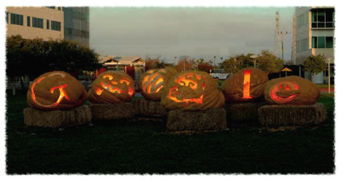
Google’s Jack-O’-Lantern logo celebrating Halloween this year is particularly cool:

Google's Jack-O-Lantern Logo for Halloween

It combines two-dimensional logo design, sculpting, and performance art, since it is a video showing the Google team sketching their designs on the jumbo-sized pumpkins, carving them, hanging out with each other, and then the jackolanterns are lit as dusk is falling, until you ultimately see only the carved letters glowing with flickering candlelight in the dark of night.

Not only is the logo fun, but it perfectly encapsulates the experiential nature of the traditional pumpkin-carving experience, and a bit of the feel of Halloween festivals here in America. The extra-large pumpkins are set on bales of hay in the central courtyard of what appers to be the Googleplex (Google’s headquarters cluster of buildings) in Mountain View, California.

I like that they designed this variation of their logo while still including the basic nature of the letters, so it’s still readable as the word while also capturing the spirit of Halloween.

Penises Invade Google Maps ♂

Friday, June 10th, 2011

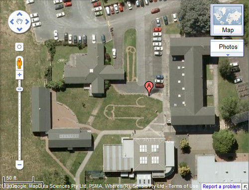
So, we’ve seen UFOs in Google Maps, illegal activites, marriage proposals, earth art, and more. Since I’ve reported on all sorts of cool things to see in Google Maps (including corn field mazes, advertisements, and more), I’ve decided to also report on the latest — a juvenile prank that’s now gotten a lot more publicity than was perhaps originally imagined. Yes, I’m sad to say that penises have now invaded Google Maps!

Penises in Google Maps

It seems that some students at New Zealand’s Fairfield College decided it would be funny to lay down phallic patterns of weedkiller on the school’s lawns, according to Stuff.co.nz. By the time the landscaping maintenance personnel realized what had happened, the penis-shaped patterns were already showing up. The maintenance people tried obliterating the definition of the patterns with more weedkiller, apparently killing all the grass.

But, not before Google’s satellite/aerial cameras caught the scenes. (more…)

White House Situation Room Photo Accidentally Reveals Government Secret

Thursday, May 5th, 2011

The photo released by the White House depicting President Barack Obama and Vice President Joe Biden along with members of the national security team during a briefing on the mission to capture or kill terrorist Osama Bin Laden is rapidly rocketing up to becoming the most-viewed photo on Flickr of all time:

White House Situation Room During Osama Bin Laden Capture Mission

The photo is fascinating for capturing what must’ve been breathless moments when the President, the military and our covert operations organizations wondered if the long search for Osama would at last prove successful.

But, what immediately caught my eye were the documents cast casually before Clinton in the photo — what were they of, and could they be revealing more than the government intended in a picture released to the public? At a glance, I expected they were satellite and/or aerial photos of the compound that Osama had built for himself to hide in. The caption paragraph of the photo page on Flickr apparently even refers directly to it, saying, “Please note: a classified document seen in this photograph has been obscured.” That really draws attention to it! It must be something interesting/cool, if it must be hidden!

I clicked on the magnifying-glass button in Flickr, to view that section of the photo with larger resolution. When viewing the original size, you can see that, indeed, the top document has been pixelated out:

Obscured Document, Situation Room - Mission To Capture Osama bin Laden

As a side note, isn’t it interesting that there are special White House coffee cups, apparently, with the presidential seal on them? Apparently they don’t do Starbucks at the White House.

I still wonder, though, did they obscure it enough? It’s not unusual for the government to redact sensitive words or other information out of documents, but in this high-tech world it’s moderately risky to allow out photos, even when you try to blur out sensitive information. As I’ve proved before, blurring and pixelation can sometimes be reversed. The type of blurring or bitmapping done to the White House Situation Room photo is pretty lossy — the person who did it would no doubt believe it could not be reversed, since so much information from that area of the photo has been discarded in the process.

Yet, in that part of the picture alone, one could apply image algorithms which would attempt to reverse out the blurring by trying to enhance the elements of the picture that are left. This requires a form of interpolation to rebuild/replace the many pixels in between the blocks of color which resulted from an averaging of the original pixels. For each large block of continuous color, there were originally many pixels in their place which got combined/averaged into a median color. From the lighting in the photo, the color of each pixel, and the context of colors around each, an algorithm could attempt to interpolate and rebuild the picture. Interpolation is a form of mathematical guesswork, so there’s a high degree of inaccuracy involved — even so, the results can be surprising at times.

There are even more advanced algorithms which can reduce noise out of images (such as for medical imaging) or which can build out missing parts of photographic images based upon photographic commonalities. (more…)
NY Artist Molly Dilworth Seeks Fame Through Painting In Google Earth/Maps

Tuesday, March 29th, 2011

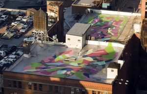
The Atlantic reported this past week on how one artist in New York, Molly Dilworth has been working to get her rooftop mural paintings picked up by the satellite imagery so that they may appear in Google Earth and Google Maps.

Rooftop Mural at 547 W 27th St, New York, NY, by Molly Dilworth

Rooftop Mural at 547 W 27th St, New York, NY, by Molly Dilworth. © Gil Blank 2009

The article reports how long the lagtime is between when the satellite and aerial photos in Google Earth are updated, and how she’s found it challenging to make the paintings visible enough to be seen in them. It appears to me that she’s progressively made the images with higher resolutions as she experiments with the medium.

As you may recall, I’ve reported on Earth Art that may appear in Google Maps as well as various attempts people have made to get messages and ads into the satellite pictures. Rooftop ads seem to come and go periodically (more…)

Squeezing PageRank from Photos & Images

Thursday, January 20th, 2011

I’ve written a number of times about how one can leverage images to get more promotional value and links. Here’s another example today, from a blog post on 1800RECYCLING.com: Ten Recycled Ship Houses.

Boat House - assembled from parts of a ship

The writer of this post contacted me a while back to get permission to use one of my photos (of a house made out of a ship) I took a few years ago on Catalina Island since the pic happened to match up with their article’s theme.

I love helping out with projects like this whenever I can, in return for links!

As I’ve mentioned before, I’ve provided images in return for links for news websites, blogs and more. To me, that longterm link value is equivalent, or better than a mere transitory image licensing fee. (more…)

Did TechCrunch’s Leaked Image Expose Their Google Informant?

Tuesday, December 7th, 2010

I was lured into reading a TechCrunch story tonight which purports to expose a new social media utility called Google +1, and I happened to see that they had blurred out the Google username in the upper right corner, likely intending to obscure the identity of their informant who leaked the screengrab image to them.

When glancing at the leaked image fully expanded, it appeared to me that the blurring of the name was somewhat insufficient, and the letters appeared tantalizingly near to being recognizable. I couldn’t help but wonder: could the blurring be reversed?

With extremely minor image manipulation, I found that the blurred name indeed could be reversed, perhaps just sufficiently to make identification possible. Of course, the image could have been taken by a different employee, so I have redacted the altered picture.

[Image redacted upon consideration, because I do not wish to accidentally impugn a possibly-noninvolved person.]

Curious, I thought to cross-reference with LinkedIn, and indeed, I found a Software Engineer at Google whose name resembled the de-blurred pic.

(more…)

Pavement Patty Speed Control

Friday, September 17th, 2010

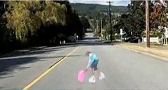
I saw this on MSNBC last week, and I thought it was clever. “Pavement Patty” is an anamorph image painted onto the street. As you drive up to it, the image of the child and the ball are designed in a perspective distortion that causes it to pop out, making it seem as though a child chasing a ball has just dashed out into the street in front of you:

Pavement Patty

Anamorphs or anamorphic projections are optical illusions that have been around since the Renaissance.

Using an anamorph in this way is innovative, although I’m not entirely convinced that painting optical illusions out in the street is a good idea. If a driver glances at the street before them, glances away, and then looks up and sees a child abruptly in front of them, they’re more likely to swerve, causing a real accident in an effort to avoid a false one.

To really see the effect, watch the video.

My Photo of Steve Ballmer Published in Metro

Saturday, April 17th, 2010

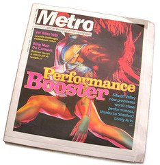
Edition of the Metro which published one of my photosWhile speaking at SMX West, I photographed Steve Ballmer’s keynote interview.

Just as I frequently do, I uploaded the photo to Flickr, and added description notes to the photos which invited bloggers and news reporters to use the photos in return for an attribution link.

I’ve had photos used frequently in online media, but this is one of the rare occasions when one of my pics has appeared in print media. The Metro, Silicon Valley’s weekly newspaper, picked up one of my photos and reproduced it in their column about Steve Ballmer’s keynote. (more…)