Posts Tagged ‘Google Logos’

Google’s Dracula Logo

Thursday, November 8th, 2012

I can’t resist mentioning Google’s Dracula themed logo today celebrating the 165th birthday of Bram Stoker!

Google Dracula Vampires Logo

Google Logo - Bram Stoker Customized Search Results Page

Sponsored search results associated with Google's Bram Stoker logo. (Click to enlarge.)

The logo presents scenes from Stoker’s Dracula uber-famous vampire book, done up in a woodcut-illustration style very reminiscent of the illustrations of Aubrey Beardsley, from the same time period. Dracula was published in 1897.

What may be more significant for search marketers, however, is the special search results page the logo is linked-to, which features Bram Stoker-related books, the Sponsored “shop for” sidebar box and the Wikipedia entry highlights box, along with the usual Universal Search items peppered through the search results listings: news search, author-tagged posts, video and image search results.

This logo and associated search results treatment seems to be specifically designed to help propel featured sponsor ad clicks, as well as to promote Google’s robust search results features.

It calls to question — will Google continue to specifically try to monetize their future Google Doodle logos in a similar fashion?

Google’s Geology Logo

Wednesday, January 11th, 2012

I thought the Google logo commemorating the birthday of Nicolas Steno, popularly known as “The Father of Geology”, was a particularly effective logo treatment:

Google Nicolas Steno Geology logo

The 3-D letters which are made to communicate the concept of cut-away views of earth sections to show layers of rock and sediment were effortless-seeming in their execution. This is a really great example of typography and graphic art — it’s very nearly an infographic — and, it does all this without losing the recognizability of the Google name (which some of their special logos have done).

Very cool!

Google’s Jack-O’-Lantern Logo Celebrating Halloween

Monday, October 31st, 2011

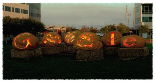
Google’s Jack-O’-Lantern logo celebrating Halloween this year is particularly cool:

Google's Jack-O-Lantern Logo for Halloween

It combines two-dimensional logo design, sculpting, and performance art, since it is a video showing the Google team sketching their designs on the jumbo-sized pumpkins, carving them, hanging out with each other, and then the jackolanterns are lit as dusk is falling, until you ultimately see only the carved letters glowing with flickering candlelight in the dark of night.

Not only is the logo fun, but it perfectly encapsulates the experiential nature of the traditional pumpkin-carving experience, and a bit of the feel of Halloween festivals here in America. The extra-large pumpkins are set on bales of hay in the central courtyard of what appers to be the Googleplex (Google’s headquarters cluster of buildings) in Mountain View, California.

I like that they designed this variation of their logo while still including the basic nature of the letters, so it’s still readable as the word while also capturing the spirit of Halloween.

Google’s Earth Art Logo

Thursday, January 20th, 2011

Google Israel has a logo for celebrating Tu Bishvat. Barry Schwartz explains that the Tu Bishvat (פרוייקט ההר הירוק) holiday is known as the “New Year of the Trees”, and to observe it many people will plant new trees or donate trees in Israel. (The associated Google search for the logo goes to “Green Mountain Project” which is an online photo album allowing people to share past photos of Carmel, which suffered a fire that ruined the trees there.)

What’s particularly interesting to me is that this special logo is based on earth art which is accomplished by people planting crops and arranging earthworks to depict pictures or words:

Google Earth Art Logo

I’ve written about crop art and earth art a number of times before, and you can also see a number of examples, as viewed through Google Maps via my past article on Search Engine Land: 20 Awesome Images Found In Google Maps.

I’m just wondering if the artist that made this Google “Doodle” logo is familiar with earth art or crop art, or whether this was just coincidental use of the earth art motif. (more…)

Happy New Year’s Day 2011!

Saturday, January 1st, 2011

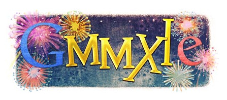
Google’s “doodle” logo for New Year’s Day today has the “OOGL” of the logo replaced with Roman numerals for two-thousand-and-eleven, and the background of it is full of fireworks going off:

Google New Year's Day Logo, January 1, 2011

Though not as well known, the letter “G” was also used as a shorthand Roman numeral in the Middle Ages to represent four-hundred, and the uppercase “E” was used to denote two-hundred-fifty. If we included these two numbers, the sequence might be read as 2011 – 400 + 250 = 1861. (more…)

Google’s Happy Birthday Logo

Monday, September 27th, 2010

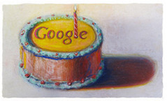
One of Wayne Thiebaud’s paintings inspired Google’s 12th birthday logo – a birthday cake with one candle taking the place of their logo.

Google's 12th Birthday Logo by Wayne Thiebaud

I like the painting – it’s an example of a great colorist’s artwork. Thiebaud is known for paintings of cakes, and is considered a Pop Artist due to his subject matter. However, the heavy pigment intensity in his work shows a dedication to colorism — intensification of hues to provide a richly experiential moment in the viewing.

It’s a less whimsical logo treatment than we’ve often seen in the past, though Google is experimenting on multiple different styles for commemorative logos.

Have Google Logos Jumped The Shark? Father’s Day Logo Illegible

Sunday, June 20th, 2010

Google’s special logos (“Doodles“) commemorating holidays and historical events have been successful at conveying a playful nature for the ever-growing corporation. As time has gone by, the special logo treatments have begun veering off from playful quirkiness and have perhaps actually crossed the line of legibility. The Father’s Day Google logo deployed today is perhaps the worst example of all:

Google Father's Day Logo

The neckties, intended to whimsically reference the letters spelling out “Google”, have become so abstracted that I think their resemblance to the letters in the name have utterly disappeared.

Graphic artists can certainly recognize and appreciate the rough symbolic shaping, but this sort of symbolic reference is really too vague for most of the public.

I’ve enjoyed watching Google play with their logo for years while dancing all over traditional corporate intellectual property law for how trademarks should be treated. I’ve long felt that Google was thumbing their nose at frustratingly conservative IP lawyers who anally force major corporate employees to follow logo use style guides mindlessly. After all, the name itself can be a trademark, regardless of graphic treatment, and trademark law certainly is flexible enough to allow some degree of logo variations. Google’s logo treatments have shown that temporary logo variations and nonstandard logo treatments can be effected without incurring risk of “losing control of the mark”.

The problem I see with today’s Father’s Day logo is that the humorous treatment has become way too subtle for its own good — the logo is illegible, and devoid of the website most reasonable individuals would be unable to see the company’s name in the treatment.

Have Google logos finally jumped the shark with this treatment? Has the joke worn thin?

The challenge for the Google logo artists has been continuing the thematic treatments without becoming a cliche. Recently, Google has experimented with enabling individuals to display custom background images on the homepage, and their “doodle” advertising the capability was so roundly criticized that they removed the feature. The background image treatment was so derivative of Bing’s changing homepage background images (which aped Ask.com’s earlier treatment) that many thought Google was trying to immitate the feature.

I think the takeway from this is that Google should stick with what is working for them and avoid straying too far from successful formulas. Today’s doodle logo lost the “Googleness” that made the concept so charming to begin with.

I expect they’ll continue displaying special logos, but they need to make them resemble the standard logo more closely or else the charm will be lost permanently.