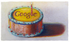
Google’s special logos (“Doodles“) commemorating holidays and historical events have been successful at conveying a playful nature for the ever-growing corporation. As time has gone by, the special logo treatments have begun veering off from playful quirkiness and have perhaps actually crossed the line of legibility. The Father’s Day Google logo deployed today is perhaps the worst example of all:

The neckties, intended to whimsically reference the letters spelling out “Google”, have become so abstracted that I think their resemblance to the letters in the name have utterly disappeared.
Graphic artists can certainly recognize and appreciate the rough symbolic shaping, but this sort of symbolic reference is really too vague for most of the public.
I’ve enjoyed watching Google play with their logo for years while dancing all over traditional corporate intellectual property law for how trademarks should be treated. I’ve long felt that Google was thumbing their nose at frustratingly conservative IP lawyers who anally force major corporate employees to follow logo use style guides mindlessly. After all, the name itself can be a trademark, regardless of graphic treatment, and trademark law certainly is flexible enough to allow some degree of logo variations. Google’s logo treatments have shown that temporary logo variations and nonstandard logo treatments can be effected without incurring risk of “losing control of the mark”.
The problem I see with today’s Father’s Day logo is that the humorous treatment has become way too subtle for its own good — the logo is illegible, and devoid of the website most reasonable individuals would be unable to see the company’s name in the treatment.
Have Google logos finally jumped the shark with this treatment? Has the joke worn thin?
The challenge for the Google logo artists has been continuing the thematic treatments without becoming a cliche. Recently, Google has experimented with enabling individuals to display custom background images on the homepage, and their “doodle” advertising the capability was so roundly criticized that they removed the feature. The background image treatment was so derivative of Bing’s changing homepage background images (which aped Ask.com’s earlier treatment) that many thought Google was trying to immitate the feature.
I think the takeway from this is that Google should stick with what is working for them and avoid straying too far from successful formulas. Today’s doodle logo lost the “Googleness” that made the concept so charming to begin with.
I expect they’ll continue displaying special logos, but they need to make them resemble the standard logo more closely or else the charm will be lost permanently.


Seattle Seahawks File For Trademarks To Escape 12th Man Agreement – Can They Do This?
Wednesday, January 28th, 2015The Eagle’s article on the subject quotes A&M’s Interim V.P. of Marketing & Communications, Shane Hinckley, stating merely that the licensing arrangement satisfies A&M’s needs and that the Seahawks have been a “great partner”. However, the agreement will expire in mid-2016 if the two teams do not renew it.
Home of the 12th Man by UW Dawgs – October 13, 2013 game between the Seattle Seahawks and Tennessee Titans at CenturyLink Field. Licensed under CC BY-SA 3.0
Can A&M officials actually be happy about the Seahawks’ efforts to trademark variations around the number 12? (more…)
Tags: 12th man, brand names, branding, brands, logos, Seattle Seahawks, Texas A&M University, trademarks
Posted in General Commentary, Law and Legal Matters | Comments Off on Seattle Seahawks File For Trademarks To Escape 12th Man Agreement – Can They Do This?